MEOW 2.1
Look LUTs for color grading
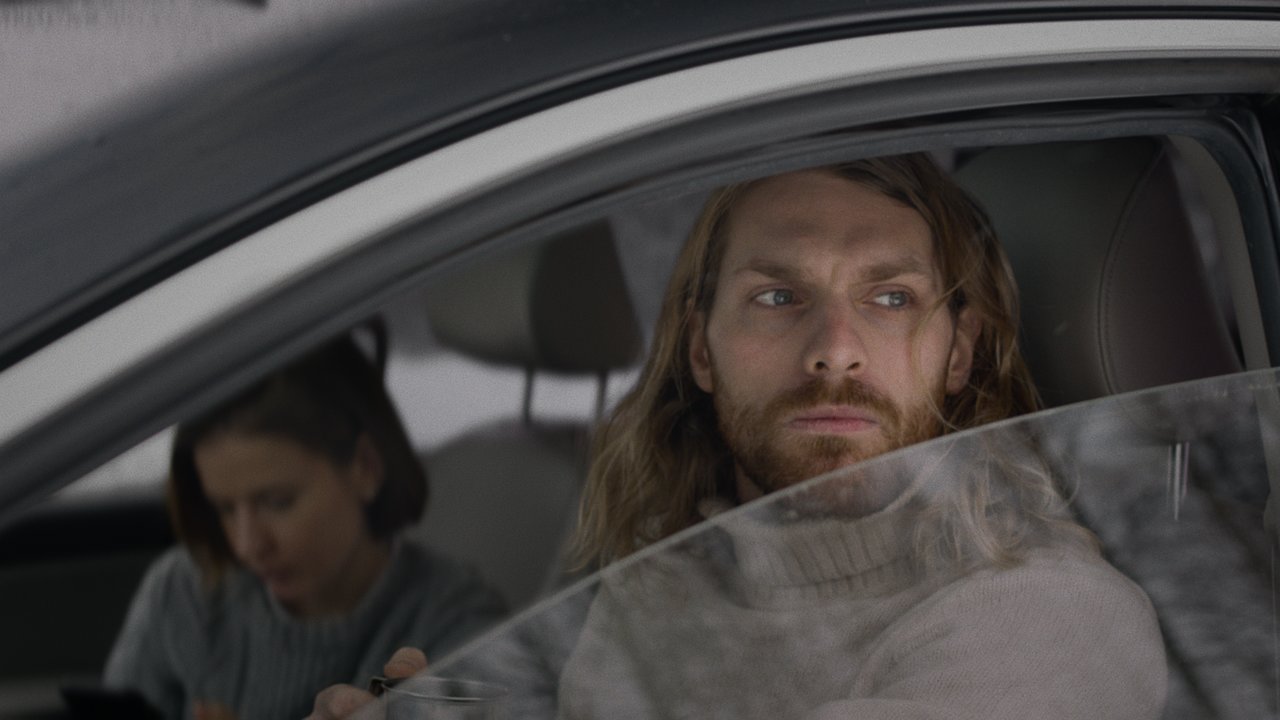
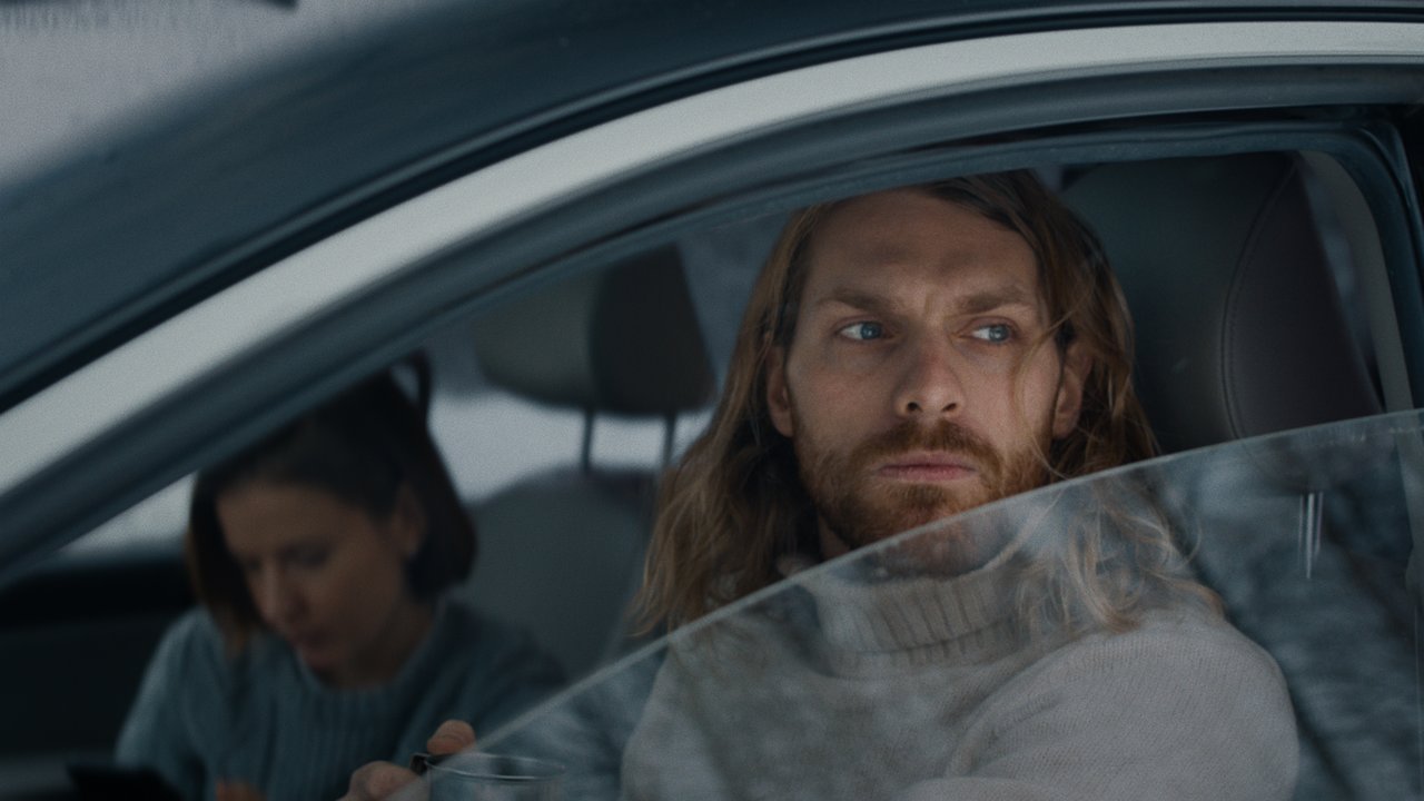
Amaryllis
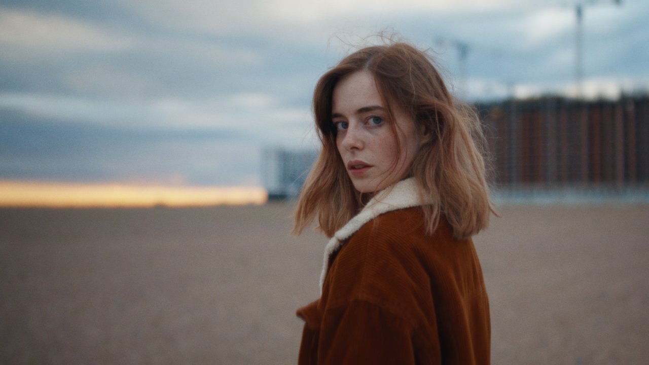
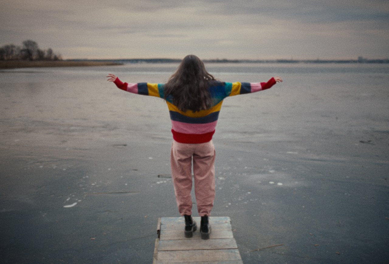
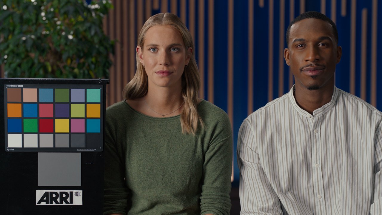
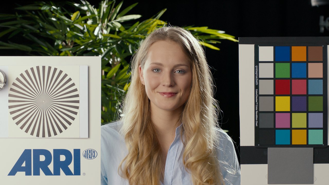
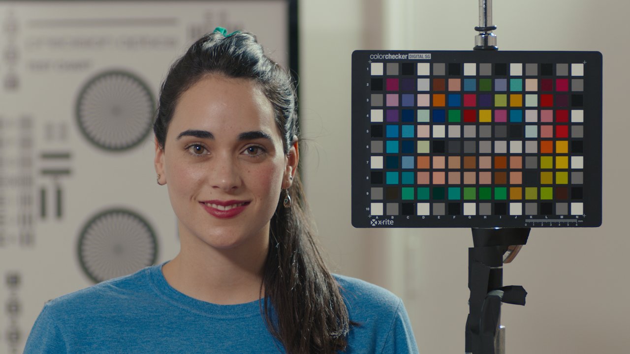
Modern teal orange look. Use it if you want to make neutral colors slightly bluish. This is not an extreme teal orange LUT that looks good with just a few shots but brings a lot of artifacts to others. This LUT carefully adds a bit of color separation. But you can easily increase it by toning your shot to cyan using color wheels and adding saturation before the LUT.
Middlemist
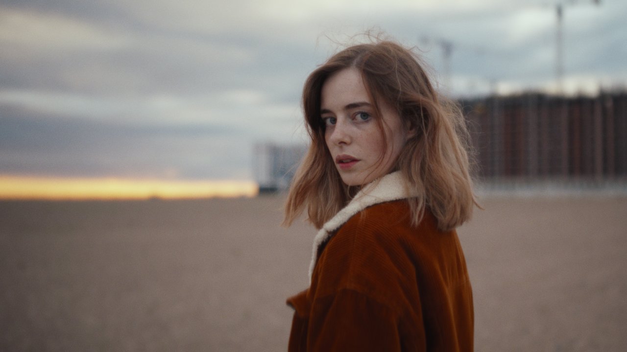
Common film look. It makes more saturated colors (especially reds and skin tones) darker. Blue colors are shifted towards the teal. Greenery is separated into sunny yellowish green and into colder deep green colors. Also, the LUT brings cold shadows and warm highlights with greenish cyan brightest whites. True blacks stay neutral. It's up to you to tint them or not.
Version History
2.1
What's new:
- New input color profiles added: Apple Log, Apple Log 2, Samsung Log
Existing 2.0 owners: re-download the pack to get the new profiles — no separate purchase needed.
2.0
- Looks and internal transforms are rebuilt from scratch. The looks are smoother now and have less contrast to better match expectations of those who are used to ARRI K1S1 tone curve.
- Middlemist Look now adds less green-cyan color in the highlights. I found it too vintage and reduced the effect.
- Scene-to-display (often incorrectly called log-to-rec709) transforms have gamut compression now, that dramatically softens transitions from one color to another on hue gradients of LUT stress test images.
- LUTs now have a film-like behavior with highly saturated colors, when they softly turning towards white instead of clipping and turning into solid colors.
- Lifted LUTs were removed. I've never used them and never heard of anyone using them either.
- Blackmagic Design Gen4 color profiles were removed. Set Gen5 for BRAW files in Camera Raw settings instead.
- All RED profiles except RED Log3G10 WideGamutRGB were removed. Set IPP2 Log3G10 WideGamutRGB for R3D files in Camera Raw settings instead.
- Panasonic GH5 V-Log LUTs removed. Shoot in HLG instead.
- New color profiles added: Alexa 35 LogC4, FujiFilm F-Log 2, Leica L-log, Leica SL (Typ 601), HLG BT.2100 Rec.2020, HLG BT.2408 Rec.2020, GoPro Protune Native*, GoPro Protune Rec.709, Z Cam Z-Log 2, DaVinci Intermediate Wide Gamut**, ACEScct AP1**
- **These LUTs (as well as all the rest) have display-referred output, NOT SCENE-REFERRED.
* and ** items are explained in Color Science Notes below.
What's Inside
All LUTs come as .CUBE files in 65³, 33³ and 17³ lattice sizes
Alexa LogC3 AWG3 LUTs with output for Gamma 2.4 Rec709 displays also come in .AML format for in-camera usage
Total number of LUTs (excluding .AML) - 936*
Number of looks – 2
Number of input color profiles – 52
Number of output devices – 3
Don't use 17³ and 33³ size LUTs for anything but field monitoring. If you can, AVOID usage of 17³ size LUTs at all. 17³ size is extremely small for most of modern 'flat' log wide gamut sources. Even 33³ is not always enough. ALWAYS USE 65³ SIZE LUTS FOR POST PRODUCTION!
LUTs Output
BT1886 – Gamma 2.4 (with 0.0 nits assumed black level) display device with Rec.709 color gamut and D65 white point used in dim surround with 5-10 nit backlight.
P3DCI – Gamma 2.6 display device with P3 color gamut and DCI white point used in dark surround.
P3D65 – Gamma 2.6 display device with P3 color gamut and D65 white point used in dark surround.
In LUTs with BT1886 output, 18% gray color (0.18 code value in Linear) roughly mapped to 10 nit for Amaryllis and 10,5 nit for Middlemist.
In LUTs with P3 output, additional "dark" surround compensation was added for better visual match between Gamma 2.4 display devices (for example, regular SDR video monitor) watched in dim surround and Gamma 2.6 display devices watched in dark surround (for example, theater projection).
LUTs Input
- Apple Log Apple Log
- Apple Log 2 Apple Log 2
- Samsung Log Samsung Wide Gamut
- ALEXA LogC3 Wide Gamut V3
- ALEXA LogC4 Wide Gamut V4
- RED Log3G10 WideGamutRGB
- Panasonic V-Log V-Gamut
- DaVinci Intermediate Wide Gamut*
- Sony S-Log 1 S-Gamut
- Sony S-Log 2 S-Gamut
- Sony S-Log 3 S-Gamut3.Cine
- Sony S-Log 3 S-Gamut3
- BMD Film Gen5 Wide Gamut Gen5
- BMD Film Gen1 BMD Film Gen1
- BMD 4K Film Gen3 (4K Prod. Camera / URSA 4K)
- BMD 4.6K Film Gen3 (URSA 4.6K)
- Hybrid Log Gamma HLG BT.2100 (21 IRE middle gray) Rec.2020*
- Hybrid Log Gamma HLG BT.2408 (38 IRE middle gray) Rec.2020*
- DJI D-Log D-Gamut
- GoPro Protune Native*
- GoPro Protune Rec.709
- FujiFilm F-Log Rec.2020
- FujiFilm F-Log 2 Rec.2020
- Nikon N-Log Rec.2020
- Leica L-Log Rec.2020
- Leica SL (Typ 601) L-Log Rec.709
- Z CAM Z-Log 2
- Cineon
- AMPAS ADX10
- Rec.709 regular video for Gamma 2.4 displays
- P3 D65 video for Gamma 2.6 displays and dark surround
- ACEScct AP1*
- Canon Log Cinema Gamut (Daylight in-camera white balance)
- Canon Log Cinema Gamut (Tungsten in-camera white balance)
- Canon Log Rec.2020 (Daylight in-camera white balance)
- Canon Log Rec.2020 (Tungsten in-camera white balance)
- Canon Log 2 Cinema Gamut (Daylight in-camera white balance)
- Canon Log 2 Cinema Gamut (Tungsten in-camera white balance)
- Canon Log 2 Rec.2020 (Daylight in-camera white balance)
- Canon Log 2 Rec.2020 (Tungsten in-camera white balance)
- Canon Log 3 Cinema Gamut (Daylight in-camera white balance)
- Canon Log 3 Cinema Gamut (Tungsten in-camera white balance)
- Canon Log 3 Rec.2020 (Daylight in-camera white balance)
- Canon Log 3 Rec.2020 (Tungsten in-camera white balance)
- Canon C500 various legacy profiles
Color Science Notes
**These LUTs (as well as all the rest) have display-referred output, NOT SCENE-REFERRED.
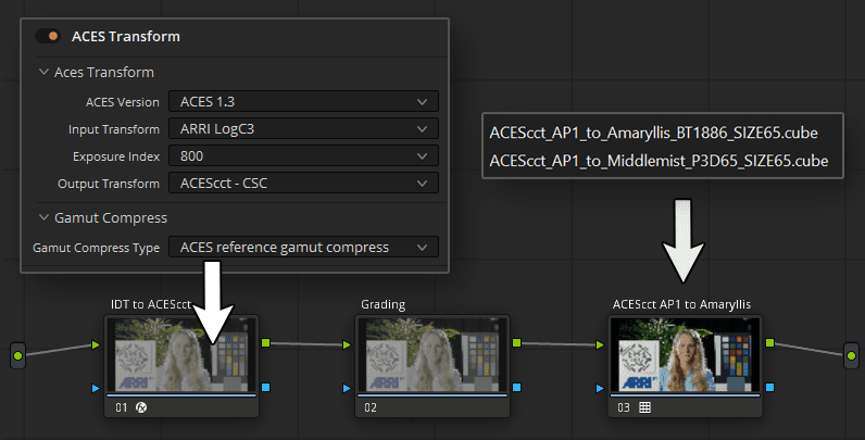
ACEScct AP1 LUTs
ACEScct AP1 LUTs should be used INSTEAD of ACES Output Transform (ODT) in custom ACES workflows, typically built using a few ACES Transform effects added to a node tree instead of using "ACEScct" Color Science in Project Settings.
DaVinci Intermediate Wide Gamut LUTs
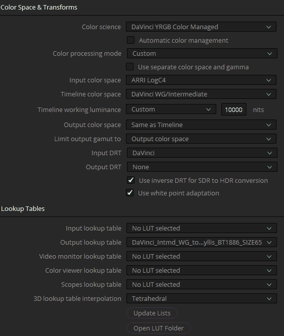
IMPORTANT!!! IF YOU USE "USE MAC DISPLAY COLOR PROFILES FOR VIEWERS" OPTION, THEN THE WORKFLOW SHOWN BELOW WON'T WORK!!!
DaVinci Intermediate Wide Gamut LUTs should be used with Davinci YRGB Color Managed. Recommended settings are shown in the image below. Input color space should be set to the color space of your source footage. If your project contains media from different cameras/sources, you can overwrite this setting per each media file by right-clicking the corresponding clips and choosing the right color spaces for each file.
*Hybrid Log Gamma (HLG) LUTs
Long story short, HLG BT.2408 is a darker version of HLG BT.2100. Use HLG BT.2408 LUT if you shot the footage with "exposure-to-the-right". If you want to know more, here is the best reading about it you can find: Recording & Editing with Hybrid Log Gamma.
*GoPro Protune Native LUT
"Native" is most likely the actual colors of a GoPro camera. But here is one thing: Every single camera in the world have slightly different colors. So even between the two identical GoPro cameras still will be some mismatch. In professional cameras like Alexa there is an additional color matrix applied inside a RAW file for converting its internal native (and unique) colors into more standard color primaries called ALEXA Wide Gamut. But I have no idea if this is the case for GoPro cameras as well. On more thing to keep in mind is that GoPro haven't published their "Native" color primaries, so the matrix I've used was taking from an unofficial source. And even if this matrix is correct, there is still one factor: each camera colors are different. I shot Macbeth ColorChecker on a GoPro camera and wasn't satisfied by the accuracy of that conversion matrix for "Native" colors. One possible reason is that their "Native" color primaries are the actual native colors, instead of something standardized and just incorrectly called "Native", meaning that it is actually wider than Rec709.
I found their ProTune Rec709 color space giving way more accurate and expected colors, so I would recommend shooting in ProTune Rec709 instead of ProTune Native as much as you can, until you really need the wider gamut for very saturated lights on set.
Preview Stills
Amaryllis
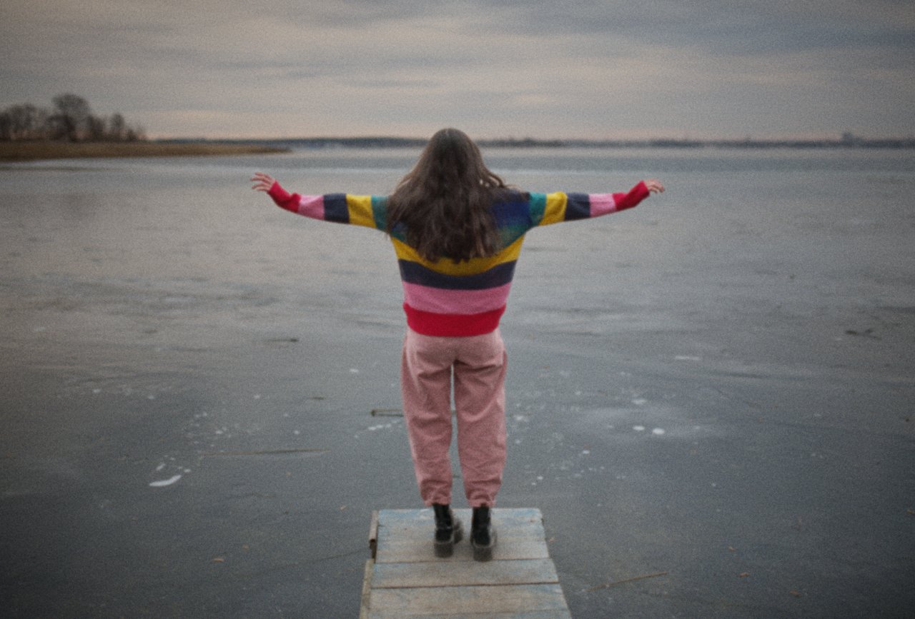
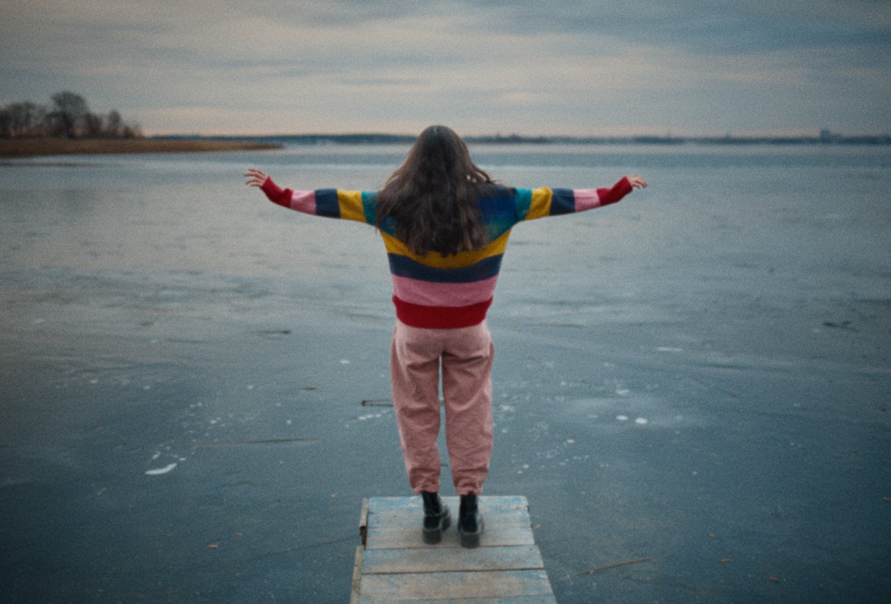
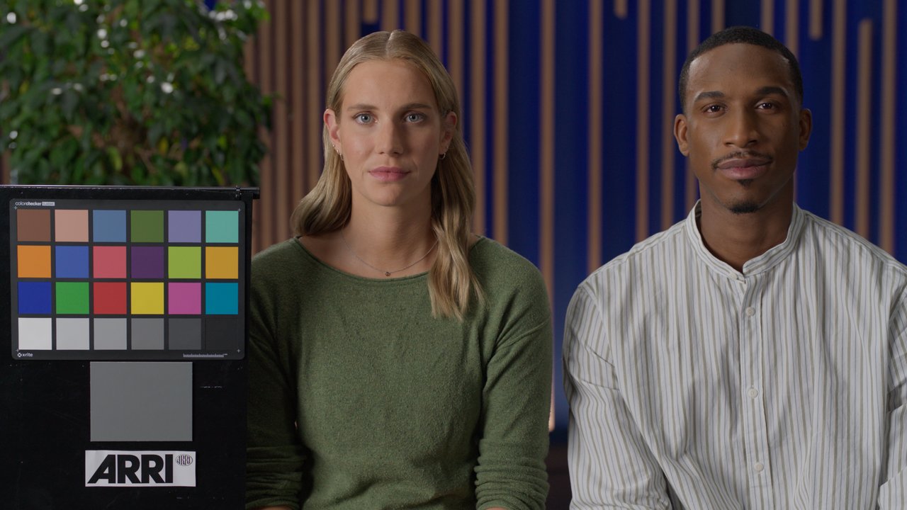
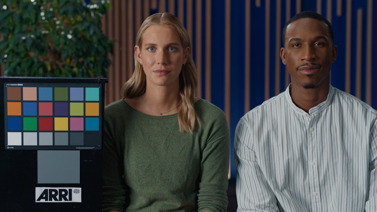
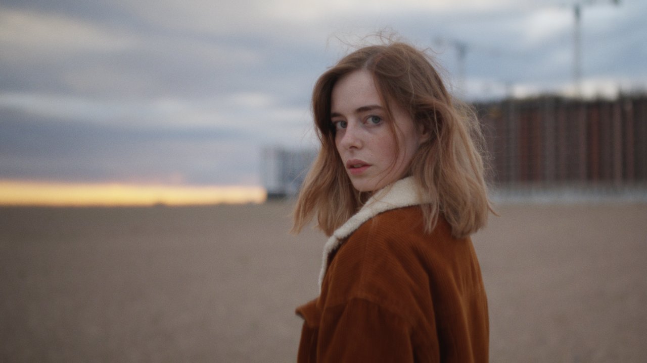
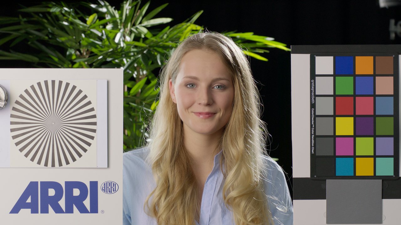
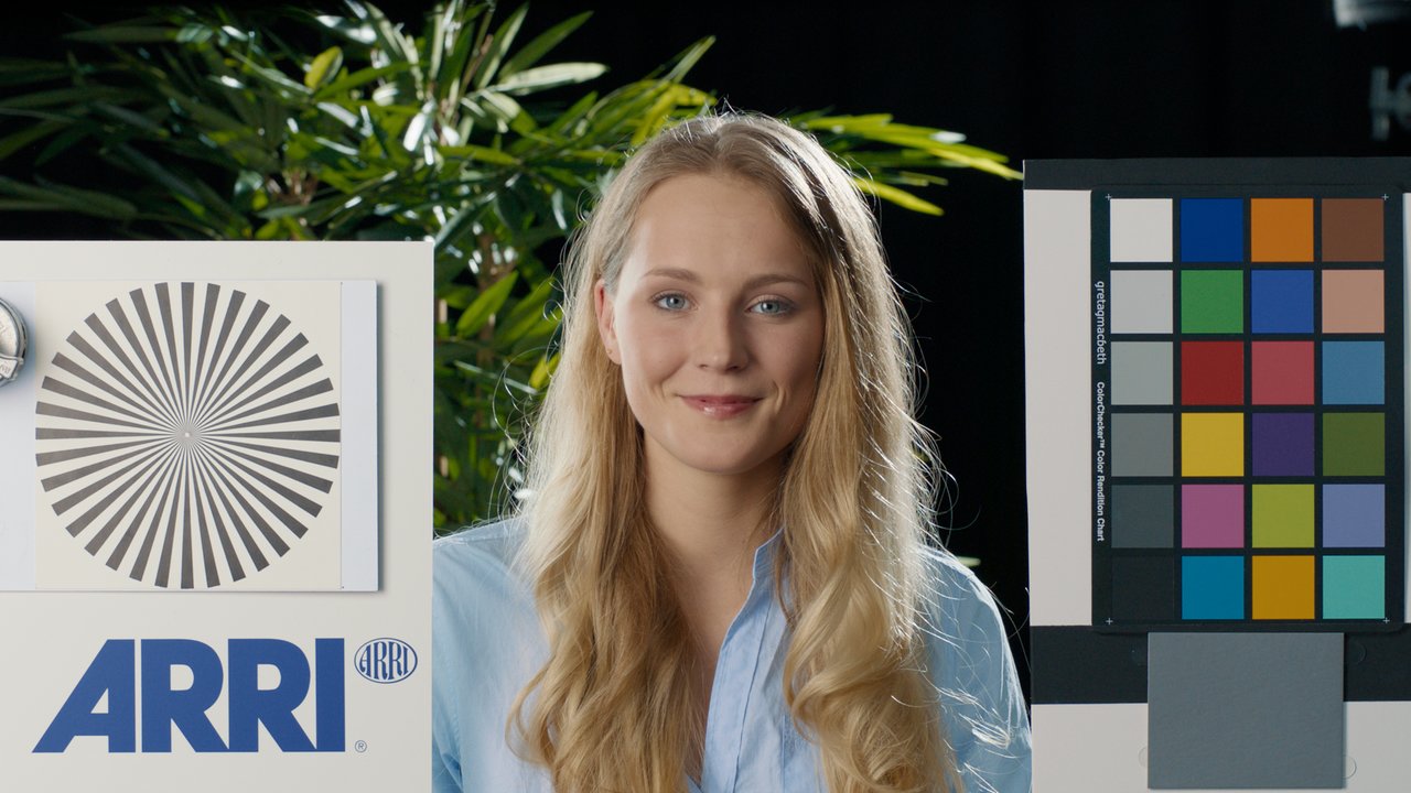
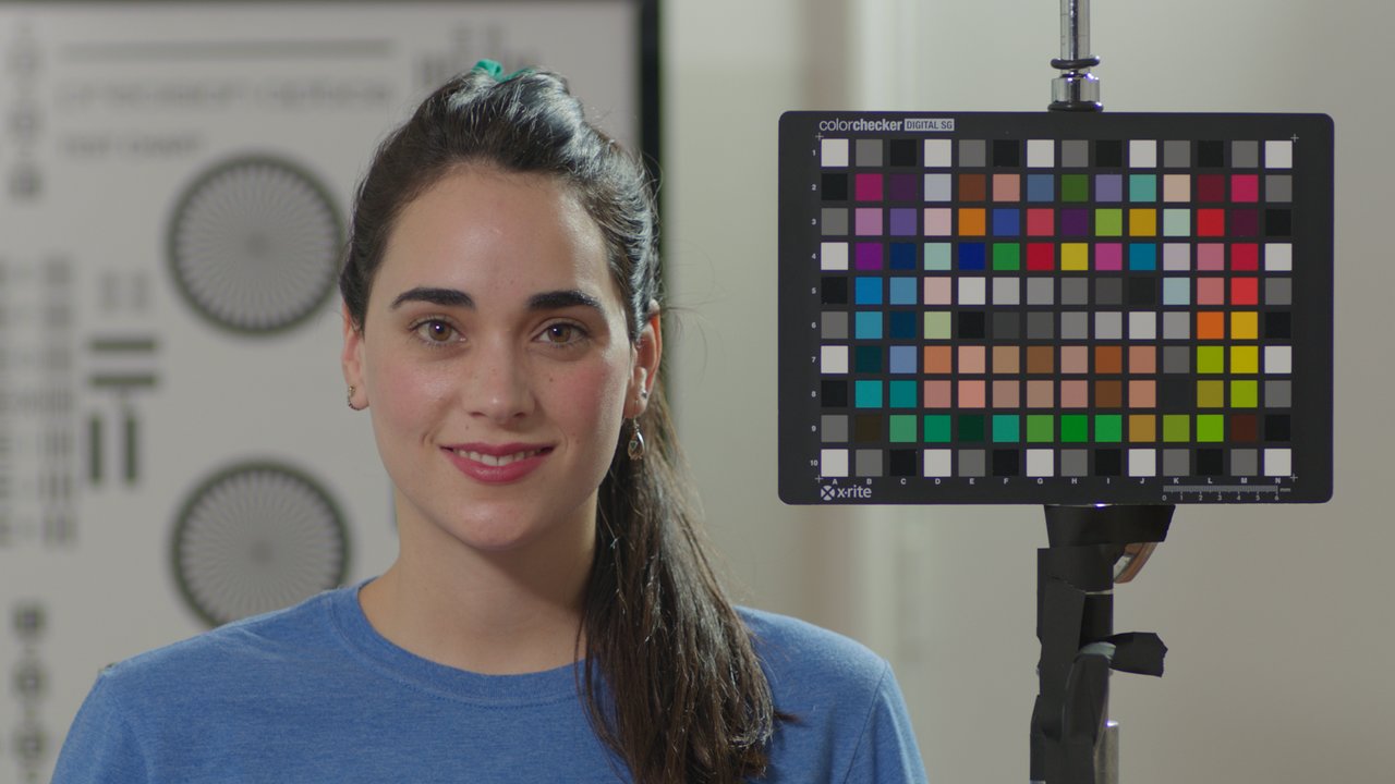
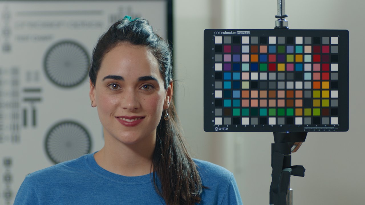
Middlemist
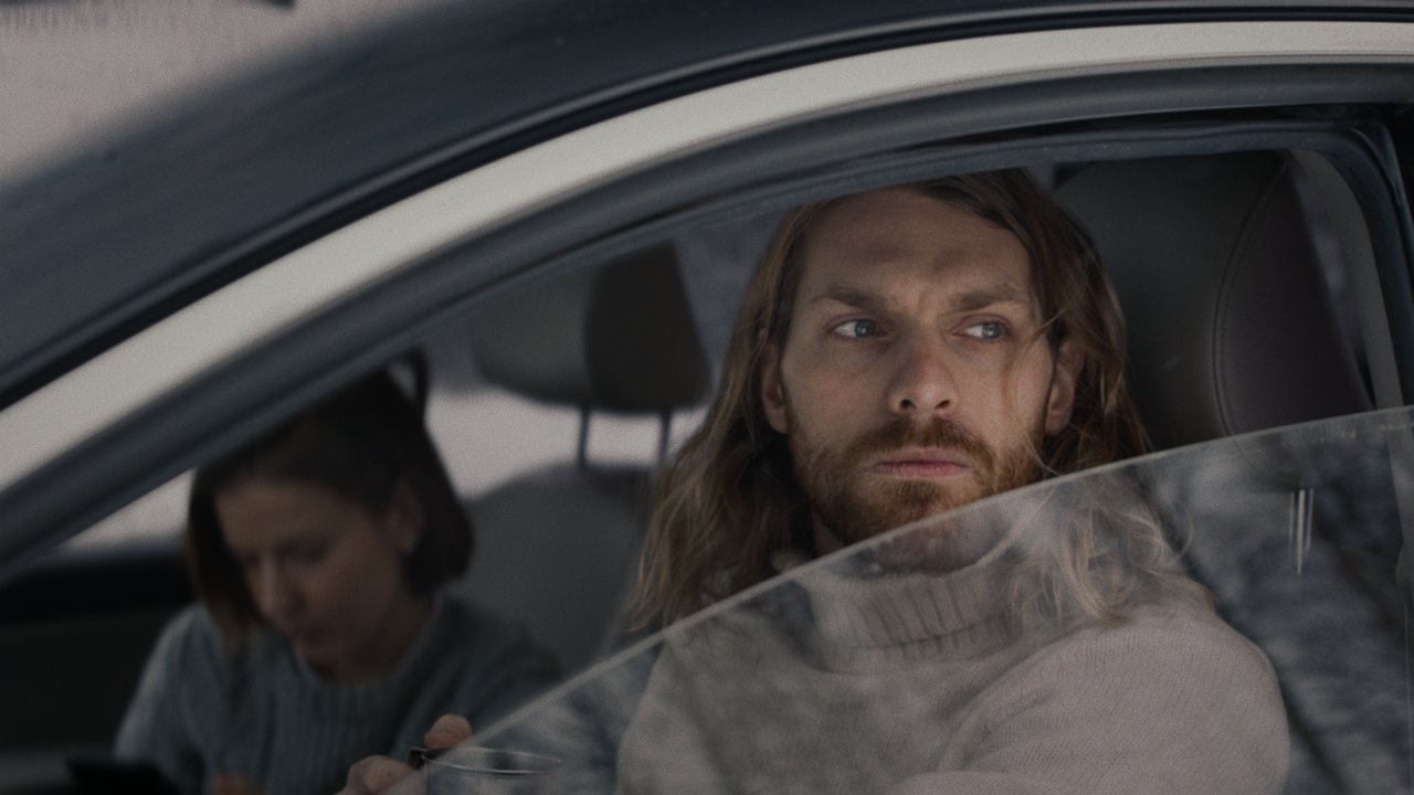
How about artifacts?
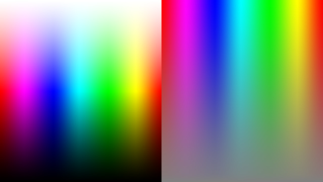
You can check out the smoothness of the LUT on the images below. A high quality LUT doesn't introduce any rapid changes to color gradients.
No LUT:
Amaryllis:
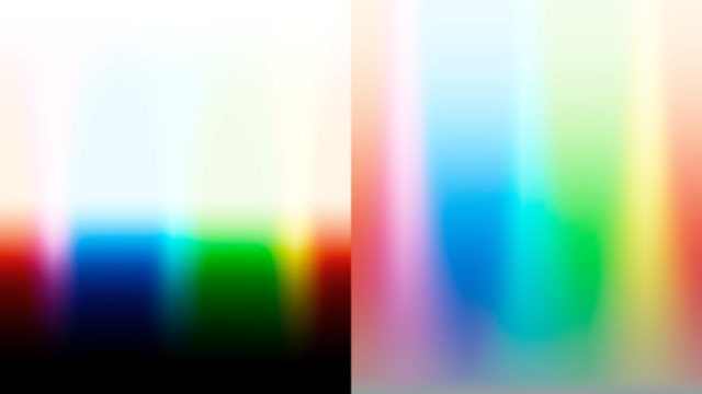
Middlemist:
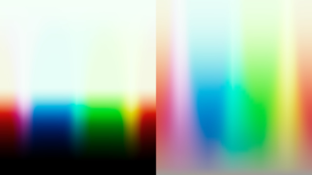
How to use these LUTs
Basic approach to using any look LUTs is the same. A look LUT should be in the end of the processing chain. If you use DaVinci Resolve, it should be placed either into a timeline node tree or into a group node tree, if any. In Premiere Pro, you should use Lumetri Color effect with a look LUT applied, with an adjustment layer. Thus, the entire project will (and usually should) have the same look. Then you should use any primary correction tools you prefer to adjust the exposure (brightness / contrast / lift-gamma-gain / slope-offset-power) and color balance (white balance / color wheels / printer lights) of each individual clip, as you like, by viewing the footage through a look LUT that comes after that individual per shot corrections. Even subtle changes to the color balance usually affect the look significantly.
Why only 2 LUTs?
A look of almost any feature film / tv show is RGB curves for toning + saturation + individual color adjustments. Color wheels are actually RGB curves that work in a specific way. And individual color adjustments are often made by a LUT, hue vs hue/sat/lum curves or by qualifying and adjusting different colors.
What makes all movies look so different is the first 2 parts of a look. So, what should you do to get a completely different look? Load a look LUT into a timeline node or into Lumetri Color in adjustment layer. Then adjust the exposure and color balance of a good looking mid or wide shot to get nice looking neutral look. This is your hero shot.
Then, if you need a more pronounced look, add a node before a look LUT or another instance of Lumetri Color before the one with the LUT. Here is where creating part of a color grading starts. Use color wheels and saturation to add mood to your project. Should it be warm or cold? More or less saturated? Maybe make it yellow? Blue shadows and warm highlights? All these creative decisions should and will be applied to all the clips. After that, when you get the look you want, you begin to adjust the exposure and color balance of all the clips individually, matching all of them to your hero shot. Of course, you can entirely skip this step, as the LUTs already have toning curves and all the other things, a colorist usually do while creating a look.
"Shut up and take my money"

The LUTs are available for more than 4 years now and as far as I can tell nobody has requested a refund yet. However, please keep in mind that there is no refund available. The LUTs are basically just simple text files, that can't be protected like software licensing tools do. If you unsure, feel free to send me the stills from you footage, so I could apply the LUTs and show you the result.
What does MEOW mean?
I spent about a week trying to find a name for these LUTs. Everything I could think of is already taken. So I gave up and called them just MEOW